1: GREASE
Art of the Title
A title sequence is the method by which cinematic films or television programs present their title, key production and cast members, or both, utilizing conceptual visuals and sound.
Three films featured in the A Brief History of the Art of the Title Sequence are Saturday Night Fever, Forrest Gump and A Series of Unfortunate Events.
Vertigo has a very effective title sequence. The typography of 'Vertigo' was in white and placed on top of an eye - the whole picture was tinted red. It was very bright and eye-catching, especially with the contrast of the white on top. The typography lifted to show an animation of a hypnotic spiral on the pupil of the eye, linking with the title 'vertigo' which means giddiness/dizziness.
The bright red of the picture suggests warning or danger - something bad will happen in the film. The hypnotic spiral also links with this danger. The character won't know that something bad has happened to them; they will be put under hypnosis and made to do things; or they will have a dizzy lack of knowledge of what is happening.
Fallen Angel's title sequence is black and white, showing that it is either an old film or has been put there for effect: this could suggest dark events happening. The fact that the titles have been placed on a long, empty road gives it a mysterious and alluring feel.
Fallen Angel shows a road with the titles coming up in the shape of a stop sign. Paired with the title 'Fallen Angel' it suggests that someone dies because of the road, e.g. a car crash.
Sweeney Todd: The Demon Barber of Fleet Street
Typography: a formal, old-style font. Suggests that it is set in the past. White, set against a dark background. Red, links with blood.
Visual imagery: dripping blood, shows that there will be a sinister mood behind the film. Linking with title: Sweeney Todd kills people? (Demon barber) The blood follows a system where someone gets thrown down a trapdoor and seemingly made into pies. Gives a big clue as to what the plot is about.
Sound elements: deep, moody music. Orchestra? Strings/woodwind are prominent. Typical of a horror. We hear the blood splattering: gross, even more sinister.
He said: Animating blood and its movement became the most crucial and challenging element of the sequence. We had to build special platforms within which we imitated blood movement and filmed it. And we had to give it this comical feel which worked really well. That was a dream project. We would love to work on something similar.
Brazil
Typography: only one word 'Brazil', like a neon sign. Fancy font.
Visual imagery: flying in the sky. Seemingly happy, gives a relaxed vibe, especially paired with music. Huge explosion cuts into the 'happy' feel.
Sound elements: first song 'Brazil'; very happy, calm. After explosion: typical horror music, strings.
The optical effects in Brazil have quite a timeless quality to them. I did not consciously set out to create something so lasting. It was more of a serendipitous happening.
Peer Evaluation of 'Celestial'
Another class evaluated mine and Jonathan's prelim, 'Celestial', telling us what went well and what we could do better.
What elements of this sequence did you feel were successful? Give at least 2 elements and explain why they were successful.
- The light flashing when the girl was walking down the hall
- The props that were used were good and effective
- The lighting was good and the angles were too
- Good costume
- Eerie opening, graveyard, black and white
- Corridor sequence - chilling non-diegetic sounds, edgy visual effects
Were there any aspects of the sequence which you felt were confusing/distracting/missing, etc?
- The tables - when they move it doesn't seem very realistic
- Lighting in the drama room could have been more controlled - Jonathan appears blurry, grainy
List 2 things which you feel would have improved this sequence?
None of
Peer Preliminary Task Evaluation
My three favourite preliminary tasks were:
1. Candyman
I thought this sequence was hilarious. They involved slapstick humour such as walking into a door (which had the effect of 'so bad it's good') and the whole idea of a drug deal was made comedic with the humorous puns such as 'a hefty bounty', before having a chocolate Bounty thrown across the table.
2. Fug Lyfe
The teacher's acting was very good, especially at the end when she put her headphones in and started dancing. Like candyman it involved a lot of slapstick comedy.
3. Time Out
A musical is a very hard thing to film so I thought this group did very well. There was an original use of songs and the storyline was very effective and much like a typical cheesy high school musical.
1. Candyman
I thought this sequence was hilarious. They involved slapstick humour such as walking into a door (which had the effect of 'so bad it's good') and the whole idea of a drug deal was made comedic with the humorous puns such as 'a hefty bounty', before having a chocolate Bounty thrown across the table.
2. Fug Lyfe
The teacher's acting was very good, especially at the end when she put her headphones in and started dancing. Like candyman it involved a lot of slapstick comedy.
3. Time Out
A musical is a very hard thing to film so I thought this group did very well. There was an original use of songs and the storyline was very effective and much like a typical cheesy high school musical.
Preliminary Task - "Celestial"
This is the final cut of our preliminary task. Jonathan and I worked together to create 'Celestial', a short horror film about a small girl who was violently murdered and has come back to seek revenge on her killer.
Pitch Presentation - Heidi
We were told to create a pitch to present to our class (film producers) in order to convince them to buy the rights to our film. We each got given a genre and an audience had had to come up with characters, actors, a storyline and marketing. I was given thriller/horror for 12A so I designed it with the genre conventions of The Woman In Black in mind, as that is a 12A thriller.
Shooting schedule
This is the shooting schedule that Jonathan and I will try very hard to stick to in order to complete all of the shots as accurately as possible. We will attempt to stay on schedule and will hopefully have completed the task by Friday 18th October.
Preliminary Task
For our preliminary task we have been set a series of actions that we must film, along with several things we should demonstrate. We have to film this for a certain genre.
It must include:
- Character 1 opening a door
- Character 1 crossing a room
- Character 1 sitting in a chair opposite Character 2
- Exchanging several lines of dialogue
... and should demonstrate:
- Match on action
- Shot/reverse shot
- 180 degree rule
- Establishing shot
- 2 close ups of characters
- Tracking shot
- High angle shot
- Flickering lights
- Long, dark corridor
- Talking to an unknown spirit
- Creepy dead girl
- Murder
The props we will use are:
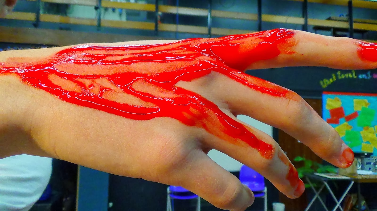
- Fake blood
- Rope
- Gag/cloth/duct tape (for mouth)
- Two chairs
- Table
- Teddy bear
These are the actions/script we will follow:
- Character 1 (Ellie) as a creepy little girl (ghost?) walking down Link corridor. The camera will be at the other end of Link on a tripod - a long, static, level shot. It will be dark, as that is one of the conventions of the horror genre, yet the lights will flicker on and off. The camera will be cut to show Character 1 advancing towards the camera in time with the flickers.
- Character 1 will then open the door to the drama studio (right) which will be dark with dim spotlights, including one on Character 2 (Jonathan) sitting bound and gagged in a chair behind a table. There will be another chair on the opposite side of the table, which Character 1 will sit down in.
- Instead of both characters exchanging dialogue, we thought we'd do it a little bit differently. As Character 2 is gagged, the only sounds he could make would be muffled and indistinguishable. Instead Character 1 will talk - the audience won't know who she is talking to; herself? Someone that she can see but the audience (and Character 2) can not. Asking why she should be the one to do it. It will build into a scream before simply saying 'Fine'.
- Blood (fake) will then begin to drip down Character 2's face. Several camera shot cuts will show different parts of Character 2's body (torso, legs etc), also covered in blood.
Opening Scene analysis
Saving Private Ryan
Genre: drama, action, war
Misé en scene:
Setting: D-Day - June 6, 1944. Daytime. Omaha Beach, Normandy, France
Costume: army uniforms. Automatically tells us that the film is a war film, and we realise that these men will either come out alive or die fighting.
Facial expressions and body language: some of the characters are being sick on the boat. This could be from sea sickness, nerves or fear. It is quite sickening to watch yet the men around remain relatively placid; they are used to such vile surroundings, or are so scared that they don't even realise that these men are vomiting right next to them. This gives the audience an insight to how these men have changed due to war.
Lighting: dull blue and grey tones. It is quite bright, indicating daytime, but as this is set during war it is quite miserable.
Camera:
- As the camera follows the boats it shakes violently; this shows us what it was like to be on the boat next to the boat in the shot, with turbulence due to the waves. From this shot we also see a man puke/spit into the sea, and this paired with the turbulence almost makes the audience feel a little seasick.
- An extreme close-up shot of Capt. Miller's shaking hand. This is effective because it shows just how scared these men would be, even though his face remains calm; he is the captain, he needs to be brave, yet he too is frightened of the outcome.
- As a bomb blows up in the near distance, the camera focuses on several men in turn. One of these shots shows a man clenching his facial muscles and trying to remain calm despite the impending doom. This is a striking shot because it becomes clear that most of these men are going to die and are aware of it, yet are doing all they can to stay calm and brave.
- Just after the aforementioned shot there is another which centres around a soldier kissing his crucifix necklace and visibly praying. He is turning to God and his religion to save him - or perhaps he isn't particularly religious but has lost hope and the only thing that could possibly save him now is God. This, again, shows how war changes people and makes them search for hope in anything.
- The camera sits in the back of the boat as all the men in front get shot. Blood splatters onto the camera and you are put directly into the scene, behind all of these dying men, and these men are dropping so quickly and ceaselessly. It is a horrible, true-to-life representation of what goes on during war and how men can be there one second and gone the next
Sound:
- The scene opens with loud, crashing waves. Like the camera shots, this puts us directly into the action, yet we realise that we aren't hearing it even half as loud as these men in the boats are.
- There is a brief moment of calm when the camera is in the boat before one of the soldiers pukes on the floor, and another soldier follows suit. It is horrible realistic and could perhaps make the audience feel a little nauseous.
- There is no dialogue until around 1 minute into the scene, when the driver has to shout at the men in order to be heard over the waves. His final words are 'God be with you', which is the only thing he could possibly say to give hope to these soldiers, regardless of whether they are religious.
- There are around five off-screen but diegetic sounds of bombs going off not far away from the boat. This brings the shocking realisation that these men are heading off to their impending deaths, and could be gone in a second.
- As soon as the land gates are open, there are loud sounds of advancing bullets, and then sounds of the bullets interacting with these men and killing them. These sounds are disturbing and continous. We hear the sounds of bullets hitting (and cutting through) metal helmets, designed to protect them, but to no avail. This gives a sense of helplessness.
Breakfast at Tiffany's
Genre: romance, drama, romantic comedy, comedy of manners
Misé en scene:
Setting: Fifth Avenue, New York City. Early morning. 1960.
Costume, hair, make-up: Holly Golightly (Audrey Hepburn) seems to be dressed from wherever she was the night before, in her elegant, jewel-embellished black evening gown, black gloves and sunglasses even though it is the early morning. Her hair is in a chic and immaculate updo, as if she hasn't spent the entire night out. Her entire appearance gives her an aura of elegance and grace, and sets the tone of her character.
Facial expressions and body language: Due to her sunglasses, we don't see many facial expressions from Holly. We watch as she looks into the window of Tiffany and Co. and eats a pastry and drinks coffee - this links to the title Breakfast at Tiffany's. She stares at the jewellery in the window for some time, at one point tilting her head and staring in what can only be described as longing, and continues looking at it even as she walks away. It is clearly an interest of the character, who may turn out to be materialistic and shallow. As the scene continues, she loses a little of her grace as she walks along hitching up her dress and swinging her arms, before running into the house to avoid a man in a car.
Lighting: the lighting begins dull and greyish, to show that it is very early in the morning with little or no sunlight, and also could be an indication that it is set some time in the past. In the second part of the scene, though, the sun has begun to shine which indicates a time difference from when Holly gets out of the taxi to when she arrives home.
Camera:
- First there is a static long shot as the taxi emerges in the distance, before the camera tracks it down the street when it comes close. As it is in the distance we assume that the taxi has no relevance, until it comes close and is a point of focus.
- There is a low-angled, over-the-shoulder shot of Holly looking up at the store building: over her shoulder we see the word 'TIFFANY' from the shop, immediately linking to the title.
Sound:
- There is no dialogue in the scene until the very end. There is just a calm, elegant, non-diegetic song which is parallel to the actions of Holly, walking slowly home, and also links to the elegance of the character.
Evaluation - Juno
What did I learn about filming and editing?
I learned that it is better to overshoot than to just shoot as much as I think I need; it's better to have too much footage which you can cut than to have misjudged timing and not have enough. Also if you have multiple shots you can choose which is the best. I learned that it is best to use something like a trolley to create smooth tracking shots rather than to just walk along.
Did I find/use any premiere effects? If so, which one and what was the effect?
We wanted to find an effect that was similar to the one used in the real Juno opening. We couldn't find one that was the same but the closest we found was called Posterize. This effect went on after the actor playing Juno passed the tree, just like the opening, and gave an almost animated effect.
What went well in the filming and editing?
We overshot a lot and did several tries on different shots so we could choose the best one. We also kept referring to the real video so we could see how different shots should be executed. During editing we all had a chance to edit and we found almost exact replicas of the video transitions used in the real Juno opening, for example Push.
What could have gone better in the filming and editing?
We could have used a smooth tracking device e.g. a trolley - we did attempt this but when on grass the shot was bumpy and uneven and often went off track, so we decided on just walking with a camera and hoping it would be smooth. In the first shot, 'Juno' (me) walks a lot faster than the original, so that could have been slowed down. We weren't skilled enough at editing to make a smooth transition from the normal camera to the animated effect so it looks a little bit jumpy.
"Juno" opening scene
Semiotics:
- Red hoodie - represents blossoming love
- Orange drink (Sunny D) - bright, sunny, good mood
- Washed out colours - calm atmosphere, peaceful neighbourhood
Representation:
- Love - atypical love because looks sad in places and she is walking alone
- Teenage girls' attitude - she is walking in the opposite direction to everyone, suggesting she is a loner. They are all running but she is walking; she isn't in a hurry to get anywhere, laid-back attitude
- Surburban area - looks a little bit rough but mostly calm and peaceful
Misé en scene:
- Costume - hoodie, sneakers and jeans suggest a laid-back attitude, tomboyish, atypical of an American teenage girl
- Make-up - no make-up, hair pulled back: simple, carefree
- Sound - non-diagetic sound. Edgy folk song, suggests that the genre is indie, the film will be happy
Camera shots and angles
Films in the media use many camera shots, angles and movement to interest the audience and create diversity throughout the movie. In Perks of Being a Wallflower, there are two scenes which particularly show a range of camera shots and angles, all used very effectively.
High angle
Close-up shot
Tilted angle
Over-the-shoulder shot
Extreme close-up
Long shot
Aerial angle
Wide shot
I think the most effective shots out of the above are the tilted angle and the over-the-shoulder shot. The titled angle because it gives a sense of the hysteria that the character (Charlie) is feeling; his mind is distorted, as is the camera. The over-the-shoulder shot is also effective because we can see exactly what is in Charlie's eyeline, and we get an idea of what he must be feeling. The fact that the shot focuses on a knife is disturbing and shocking.
Media institution logo
This is the logo that I designed for my media institution. It is called 'Iridescent Innovations'. The definition of iridescent is 'Showing luminous colours that seem to change when seen from different angles'. I thought this was appropriate for an institution title because the fact that it shows 'luminous colours' suggests that the films are bright and interesting to watch; also, every film is seen by every person in a different way. The fact that the colours 'seem to change when seen from different angles' highlights the different ways in which audience members view the film.
I chose to design the logo in this way because the films that I would make under this institution would be indie films (similar to Submarine (2010), (500) Days of Summer (2009), About Time (2013)) and I went for an almost vintage look with an old-fashioned film reel and simple colour scheme.
Representation
What is being represented? How?
- Love is being represented in this trailer. It is first presented as a fairytale (Barthes). The trailer begins with Summer (Zooey Deschanel) announcing that she has the same music taste as Tom (Joseph Gordon-Levitt) in an elevator. This is a very realistic representation of love - it can spark in any place at any time with any random person. The film is based around fate, which is very mythical and fairytale-like (true to Barthes).
- Heartbreak is also represented in the trailer. Straight after the love is presented, Summer says 'I think we should stop seeing each other'. There are pieces of dialogue interjected into the trailer during which Summer says things
Media representation
How does media represent women?
'Nuts' magazine presents women as sex objects. The focus of the cover is a half-naked Gemma Atkinson, whose body is touched up and pushed up to the idea of 'perfection', designed to taint men's minds until they think that this is perfection and degrade women who do not look this way.
The biggest feature on the page is 'Britain's 50 Sexiest Single Babes', with the tagline 'Gents - these ladies need you!' suggesting that women have no choice in their single life and need a man to survive. It also degrades women that don't look like those in the magazine.
The heading above 'Nuts' states 'Rosie & Kaylee's Valentine's Strip!' - pictures of naked women which are designed for men on Valentine's day, suggesting that women are there simply to please men.
The magazine is £1.60 which is cheaper than most women's magazines, suggesting that to look at women is cheap - women are cheap.
The heading above 'Nuts' states 'Rosie & Kaylee's Valentine's Strip!' - pictures of naked women which are designed for men on Valentine's day, suggesting that women are there simply to please men.
The magazine is £1.60 which is cheaper than most women's magazines, suggesting that to look at women is cheap - women are cheap.
Poster Analysis - (500) Days of Summer
The movie '(500) Days of Summer' has several official posters. Each have different connotations.
The first poster is this one. This gives a clear hint as to what the story is about: a romance. However the tagline is 'This is not a love story... this is a story about love.' This hints that it is a love story with a twist. Linking with that is the picture, the main focus: Joseph Gordon-Levitt is leaning into Zooey Deschanel, showing his affection towards her. However, she isn't facing him, her leg is turned away and she is even looking in the opposite direction, despite her smile. This could suggest that she doesn't feel the same way about him, highlighting the fact that this is not a love story, as a love story generally implies that both characters love each other. The smile could be fake and implies that she is stringing him along; he feels as though she appreciates him. The colours are very minimalist and plain which contradicts what we get from the picture and tagline: white and dull blue-grey are very simple and straightforward, whereas from the picture/tagline we get that the plot is twisted and complicated. This is not your standard romantic comedy.
The second poster shows Joseph Gordon-Levitt, alone, sketching. He is the focus of the picture, suggesting that he is the main character. The giant yellow sun highlighting the title - specifically the word 'Summer' - suggests that the film is a happy, sunny one. The title is a play on words as the main character (other than Gordon-Levitt) is called Summer (Zooey Deschanel). This play on words is emphasised by the sun. There are lots of colours, in contrast to the above poster, which could suggest that the film is a happy-go-lucky and bright one. There are lots of pictures of a girl in the background, showing that there is a link between her and Joseph Gordon-Levitt's character. What we don't get from this poster is that the plot is twisted and complicated - it seems a straight-forward and happy rom-com in which Gordon-Levitt and Deschanel's characters are romantically involved.
The final poster I will be analysing is this one. This shows Joseph Gordon-Levitt looking down at his t-shirt. On his t-shirt are pictures of him and Zooey Deschanel. This immediately makes us think that it is a romantic comedy, as in one of the pictures they are kissing and on another they are watching a movie. There are several pictures of Deschanel on her own, showing that she is the object of his affections. However, there is one picture which matches the first poster I analysed: Gordon-Levitt is leaning into her and she is looking down, avoiding his gaze. In the biggest picture we see them looking at each other though neither looks particularly happy and they are standing relatively far away from each other, in contrast to the other pictures where they are in close proximity to each other.
Representation - Action and Rom Com
Action movie:
This picture represents an action film. The car is the main focus of the picture, showing that the movie revolves around a race or car chase. The building in the back could be any number of things, for example a bank - there could be a robbery which requires a quick getaway. It also shows that it is set in a city or town, which is relevant as most action films aren't set in the countryside/field.
Colours: Blue is seen as a masculine colour, suggesting that the main character is a male. The stripe on the car shows that it is a sports/racing car.
This picture represents a chick flick. There is a kiss print and two bars of soap on a tissue. This is very representative of a girl who cares about her appearance. Immediately we see the kiss print as it is the only colour in the picture. This makes us think of lipstick/make-up in general and points us in the direction of teenage girls, whom this movie would probably be based around. The soap and tissue represents cleanliness: again, girls who care about their appearance.
Colours: White is the prominent colour in this picture. White represents purity and cleanliness, which ties in with the idea of girls caring about their appearance. White could also represent innocence. The stain on top of the white suggests that her innocence has been tainted; perhaps the movie centres around a good girl turned bad. Pink also suggests girlishness, or can be associated with make-up (lipstick) and therefore represent falseness, or a mask disguising the person underneath. This gives a whole new storyline.
Narrative
Action code:
- Cycling on the bike
- Checking the time and jumping out of bed - is he late?
- Sprinting through the street
- Cutting the line to get coffee - how can he jump the queue? His relationship with the coffee girl?
- Talking on the phone as she walks - who is she talking to?
- Spilling the coffee
- Typing a message: 'It's here!' - why do they call her 'It'?
- Rushing to do work - why are they all nervous of her?
- Questioning the message on the coffee
- Answering the phone - who is Bob?
Enigma code:
- Who is the woman?
- Who is the man?
- What is the relationship between them?
- What is the relationship between the guy and the coffee girl?
- Why is he in a hurry?
- Who is the guy who he trades shirts with?
- Why is everyone so nervous around the woman?
- Why do they call her 'It'?
- Who is Bob and why are they going to his office?
Key characters:
- Sandra Bullock - the boss. A wealthy, important woman who is confident and causes fear in her employees
- Ryan Reynolds - the assistant. Dresses nicely, suggesting he has a good wage. A step beneath the boss. Friends with the other employees
- The coffee girl. Clearly likes Andrew (Reynolds) as she puts her number on the cup
- The friend who gives Andrew his shirt. Good friends as he is willing to do something for him
Cultural code:
- Gym equipment in her house - she can afford luxuries
- In bed alone - he has no partner
- Checking her appearance - she is vain/cares about her appearance
- Wearing a suit - he dresses nicely for work, has a high position
- Stylish kitchen apartment - wealthy
- Doesn't have to queue/pay for coffee - friends with the coffee girl
- Crowded street - has a high-end job
- Talking to a writer on the phone about Oprah - posh, important job
- Shouts at co-worker - higher in the hierarchy than him
- Group message to all co-workers - they are all close friends
- Immediately lists things that she needs to do - busy job
Semiotics
Semiotics is the study of signs. With semiotics we have denotations and connotations. A denotation is what we see when we look at an image - simply what it is. A connotation is what we understand from this image, so what the image could mean.
This poster is for hit TV show Glee. Straight away we see a couple (Rachel and Finn). This is a denotation. The couple are larger than most of the other characters and in the centre of the poster. From this we can tell that the main storyline revolves around these two characters. This is a connotation. We can tell that they're in love as they are staring into each other's eyes; Rachel has her hand on Finn's leg; he has his hand on her face; his mouth is open in a way that suggests he is singing to her.
On the right we see one of the biggest characters (Coach Sylvester) on the poster. The fact that she is bigger than the rest suggests she holds power over them. We see that she is the 'villain' as she is pulling the plug - literally - on their show, causing the 'e' in 'Glee' to blow out and smoke. This suggests her storyline - she tries to stop the Glee club throughout the show. The fact that she is in uniform and is blonde makes the audience think back to Nazi times - she is almost a dictator.
To the left we see the other biggest character on the poster (Mr Shue). He is dressed like a typical teacher, and the fact that he is smiling and leaning back with his hands in his pockets suggests that he is the laid-back, cool teacher - the exact opposite to Coach Sylvester. Typically enemies stand on opposite sides of the image, which suggests that they have conflict throughout the show.
At the back of the poster is a girl, Quinn, higher than the rest, suggesting she believes she is higher in society, almost like a 'queen bee'. She is also in uniform, just like Coach Sylvester, showing that she is a follower of the villain and therefore enemy to the rest of the characters.
Sitting on the 'G' of 'Glee' is another woman (Miss Pillsbury), presumably another teacher due to her formal attire, staring at Mr Shue with her hands over her heart. Her entire body is turned towards him showing that she can't help herself, and there is a look of desire on her face. This automatically gives away the main storyline of her character - she is irrevocably in love with Mr Shue.
The other four characters on the poster are members of the club - we can see that they are united in some way as they all, along with Finn and Rachel, are dressed in shades of blue. Each are very different - there is a male in a wheelchair (Artie), a clearly homosexual male (Kurt), an Asian goth (Tina) and an African-American female (Mercedes). Each have clear storylines that we can see just from the poster.
Genre connotations
The opening scene of The Woman in Black sets the tone of the rest of the movie. The genre of the movie is horror/thriller, which is clearly depicted in this scene through use of colour, action and sound. The scene is dingy and darkly-toned which is usually associated with horror movies. The dinginess also suggests the time period; there are no electric lights in the room, so it is assumed that the movie is set quite a long time in the past, most likely the middle-to-late 1910s.
The music - a haunting, high-pitched song - fades in gradually. Soft piano tunes are associated with little children. This association probably stems from nursery rhymes having a soft, soothing nature to send children to sleep. The idea of sending children to sleep heavily foreshadows the coming events of the scene: the three girls in question all stare at something unseen by the audience before rising to their feet and walking to the windows in unison with blank looks on their faces. They then proceed to throw themselves out of the window, killing themselves. This gives a deeper meaning to the nursery rhyme-type music.
Genre
The opening sequence of Now You See Me begins on a street in America late at night. As it cuts through several small scenes, the setting changes to inside an American office during the daytime, then on a boat on the ocean around late afternoon/evening as the sky is just starting to colour, and finishing inside at a magic show. The theme of the opening sequence is magic, as all four short scenes show magicians of some kind.
Icons used in the opening sequence include a pack of cards, a wallet, a tank of water and chains. The story is told of four individuals who use magic as a hobby or a job. The narrative suggests that the characters' stories are likely to intertwine.
At certain points of action, a heavy drum beat fills in pauses between dialogue, dimming down only to hear the speech. This creates a tense, action-filled atmosphere, suggesting the pace of the rest of the movie.
mise en scene: Costume: all main characters dressed in an item of black clothing.
actors: Jesse Eisenberg, Woody Harrelson, Mark Ruffalo, Isla Fisher
props: pack of cards, spoon, wallet, small billboard, fish tank and water tank, chains and cuffs.
Subscribe to:
Posts (Atom)